In the last couple of days, there have been lots of red and blue maps floating around online. Unsurprisingly, they show a vast divide between the Northeast/West and the rest of the country.
Here are some more interesting maps:
From USA Today, a county-by-county map: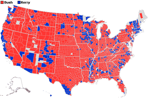
From informedpublic.com, one of many snarky what-if maps: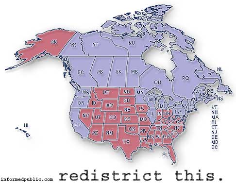
From the New York Times, a US population density map:
...and a map weighted by electoral vote: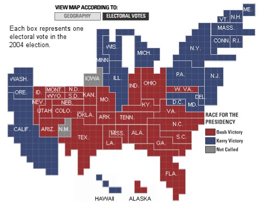
From a professor at Princeton, a shaded county-by-county map: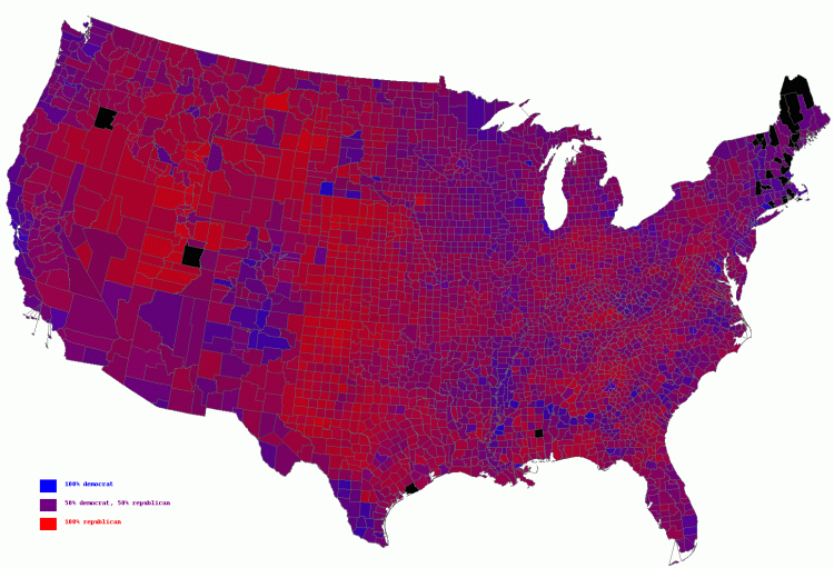
Artwork
8 years ago
No comments:
Post a Comment